UPS is the largest package delivery company in the world who is always able to provide the fastest devilry server to its customers.
Last week, I had a piece of document to ship back to China. I visited the official website of UPS, but then I had a terrible experience while using their website. When I access the website, I quickly notice the problem of its responsive design. Since I’m using a pretty wide screen with a 1920 * 1080 resolution, the whole web page is sticking on the left side of my browser, while the right half is remaining blank. (see the picture below)
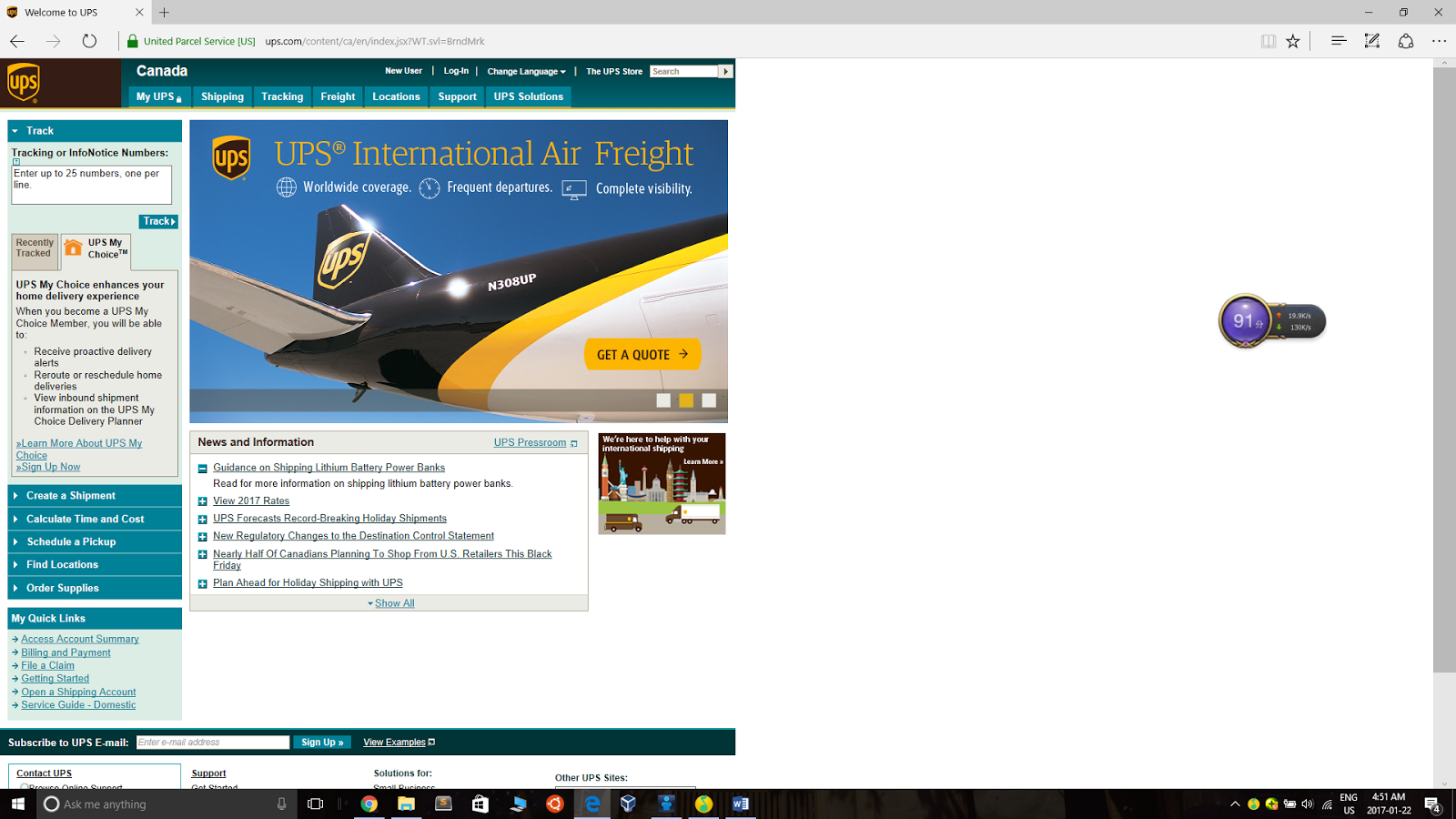
There’s an obvious navigation bar at the top of the home page, where contains some user account features such as login setting, view profile, create a shipment. etc. At the left side is an inconspicuous horizontal feature list, where some very important features, such as tracking package, check the delivery rate and time cost, etc, are containing in it.
I don’t see the point to separate them. Since the words and buttons on the left feature list are too small and insignificant, when I first access to the website, my attention would be on the top navigation bar, instead of the left one. But those features at the left are much important than those at the top. For this reason, I’ve spent a very long time on finding the “find cost and rate” button when I first visit. Moreover, since I don’t have an account on their website yet, those buttons, such as account summary, login setting, profile, are useless to me.

When the user wants to create a shipment, they have to fill in a form. At the end of this form, there are two buttons: one is called “start over”, and another is “next”. The start over button seems to be meaningless to the user because if the user wants to clear the form, they can just easily refresh the page. Since the color of the “start over” button and the “next” button is same, the user might accidently click on the “start over” button and accidently delete all input that they just type in.

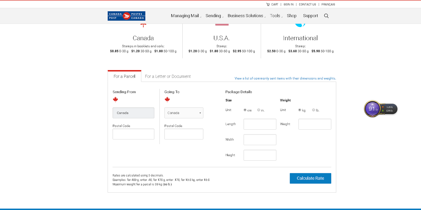
Compare to the UPS website, Canada Post’s website has a nicer UI design and a reasonable layout. When I first access to their website, I can quickly notice some key features including tracking, find the postal code, check rate, etc. When I check the price rate, it requires me to fill in a form. There’s only one submit button at the end of the form, which is much more clear than UPS’s form.